

OVERVIEW
OVERVIEW
OVERVIEW
OVERVIEW
Located in Frisco Texas, Dr. Taylor is a Clinical Neuropsychologist dedicated to helping patients and their families receive help and resources to better cope and manage their day-to-day lives.
Located in Frisco Texas, Dr. Taylor is a Clinical Neuropsychologist dedicated to helping patients and their families receive help and resources to better cope and manage their day-to-day lives.
Located in Frisco Texas, Dr. Taylor is a Clinical Neuropsychologist dedicated to helping patients and their families receive help and resources to better cope and manage their day-to-day lives.
SCOPE
SCOPE
SCOPE
SCOPE
Brand Re-design
Visual Identity
Brand Assets
Collateral
Character Design
Brand Re-design, Visual Identity, Brand Assets, Collateral, Character Design
Brand Re-design, Visual Identity, Brand Assets, Collateral, Character Design
Brand Re-design
Visual Identity
Brand Assets
Collateral
Character Design
BRIEF
BRIEF
BRIEF
Dr. Taylor was in need of a rebrand that was professional but also fun and easy-going since visiting the doctor can sometimes be a stressful and uncertain experience, especially among children. It was imperative that the brand possess an air of playfulness while maintaining its image as a reputable office.
Dr. Taylor was in need of a rebrand that was professional but also fun and easy-going since visiting the doctor can sometimes be a stressful and uncertain experience, especially among children. It was imperative that the brand possess an air of playfulness while maintaining its image as a reputable office.
Dr. Taylor was in need of a rebrand that was professional but also fun and easy-going since visiting the doctor can sometimes be a stressful and uncertain experience, especially among children. It was imperative that the brand possess an air of playfulness while maintaining its image as a reputable office.
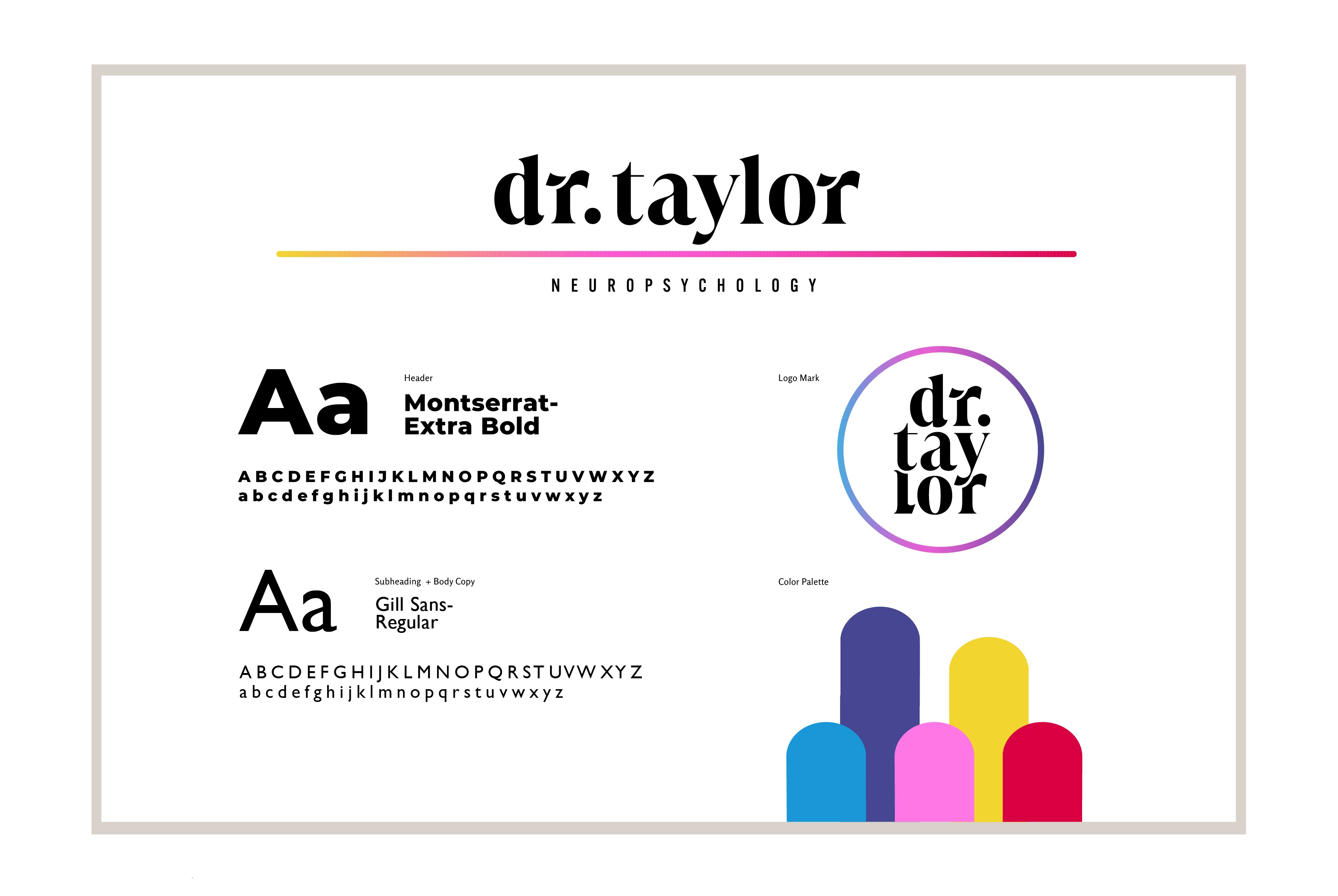
Logo and Visual Identity
Logo and Visual Identity
Logo and Visual Identity
Logo and Visual Identity
Secondary Marks
Secondary Marks
Secondary Marks
Secondary Marks



Brand Assets
Brand Assets
Brand Assets
Brand Assets




ICON BREAKDOWN
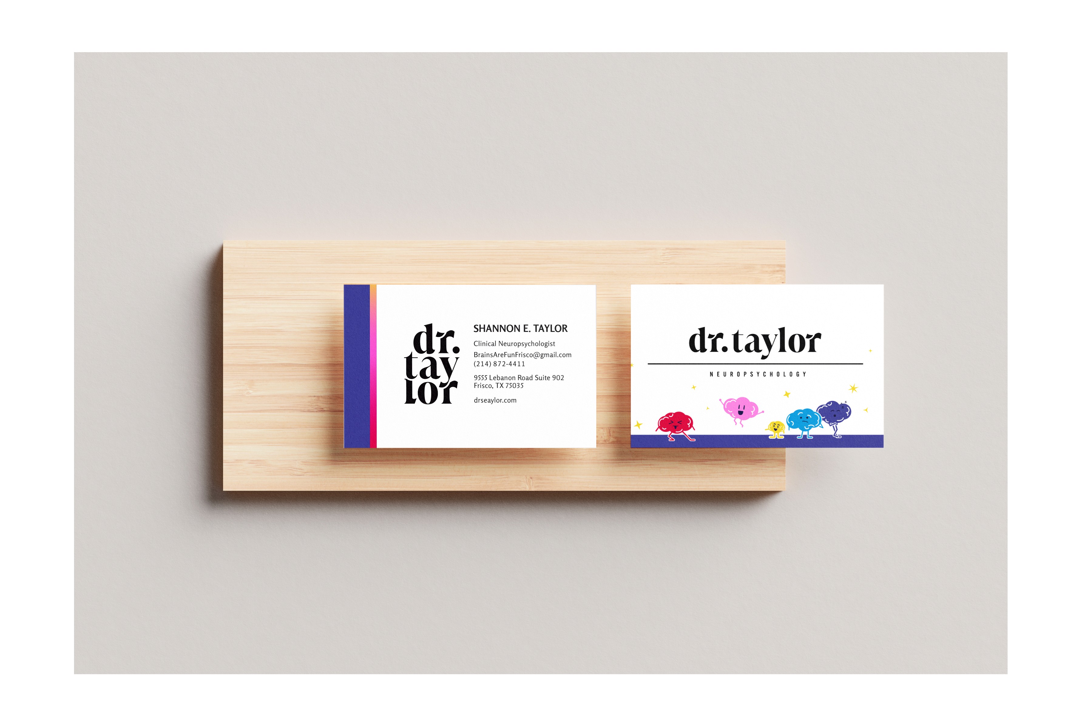
Business Card
Icon Breakdown
Icon Breakdown
The curves integrated into the letter R, and between the L and T convey movement and are symbolic of the neural pathways throughout the brain.
The lowercase typography feels down to earth, approachable, relaxed, and relatable.
Mark creates visual interest and is easily identifiable and credible to Dr. Taylor
The presented mark easily scales and remains legible. Additionally, the mark can stack like shown or sit horizontal depending on usage and setting.


The presented mark easily scales and remains legible. Additionally, the mark can stack like shown or sit horizontal depending on usage and setting.
Mark creates visual interest and is easily identifiable and credible to Dr. Taylor
The lowercase typography feels down to earth, approachable, relaxed, and relatable.
The curves integrated into the letter R, and between the L and T convey movement and are symbolic of the neural pathways throughout the brain.
ICON BREAKDOWN
Business Card
Business Card
Business Card
Business Card

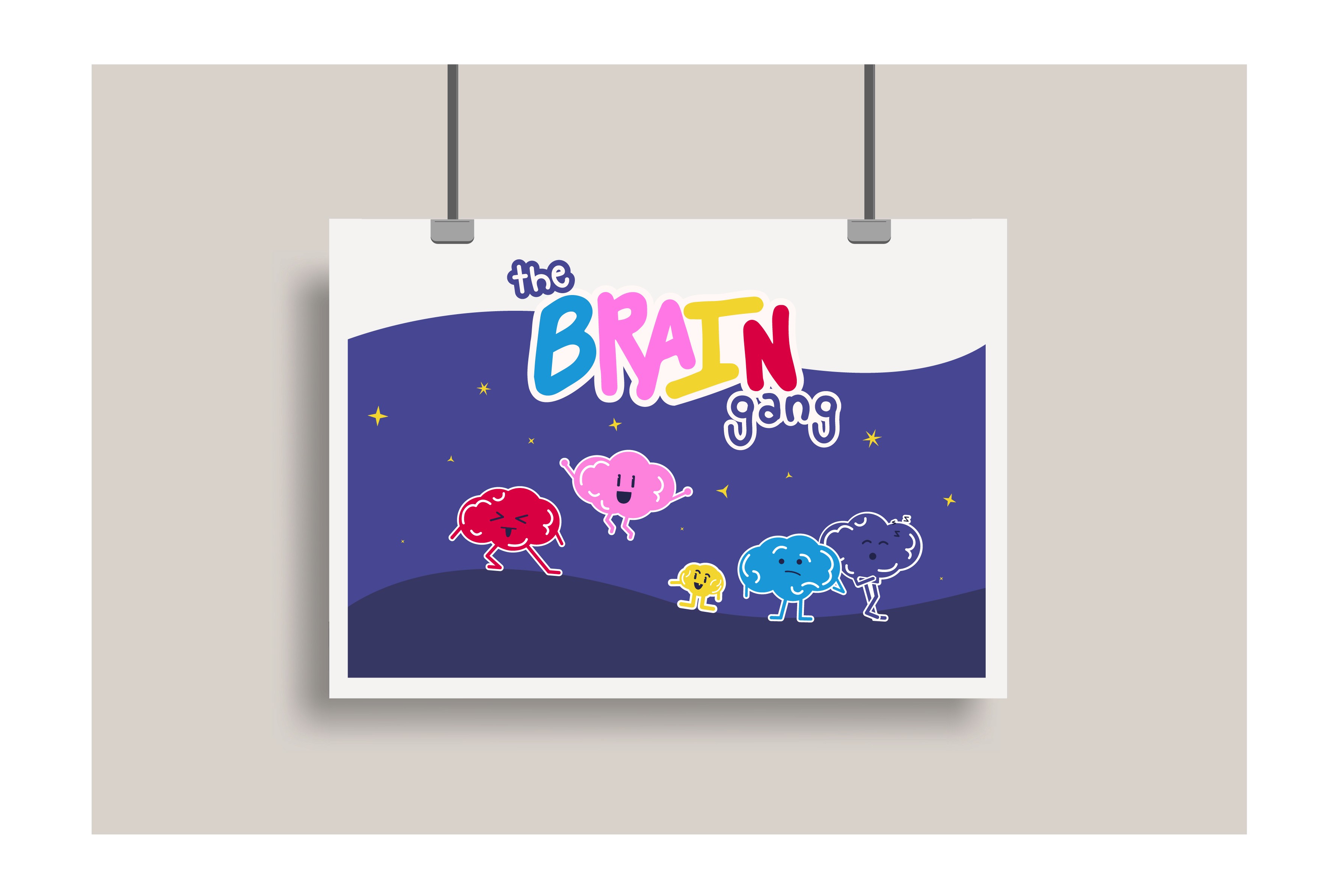
Character Design
Character Design
Character Design
Character Design
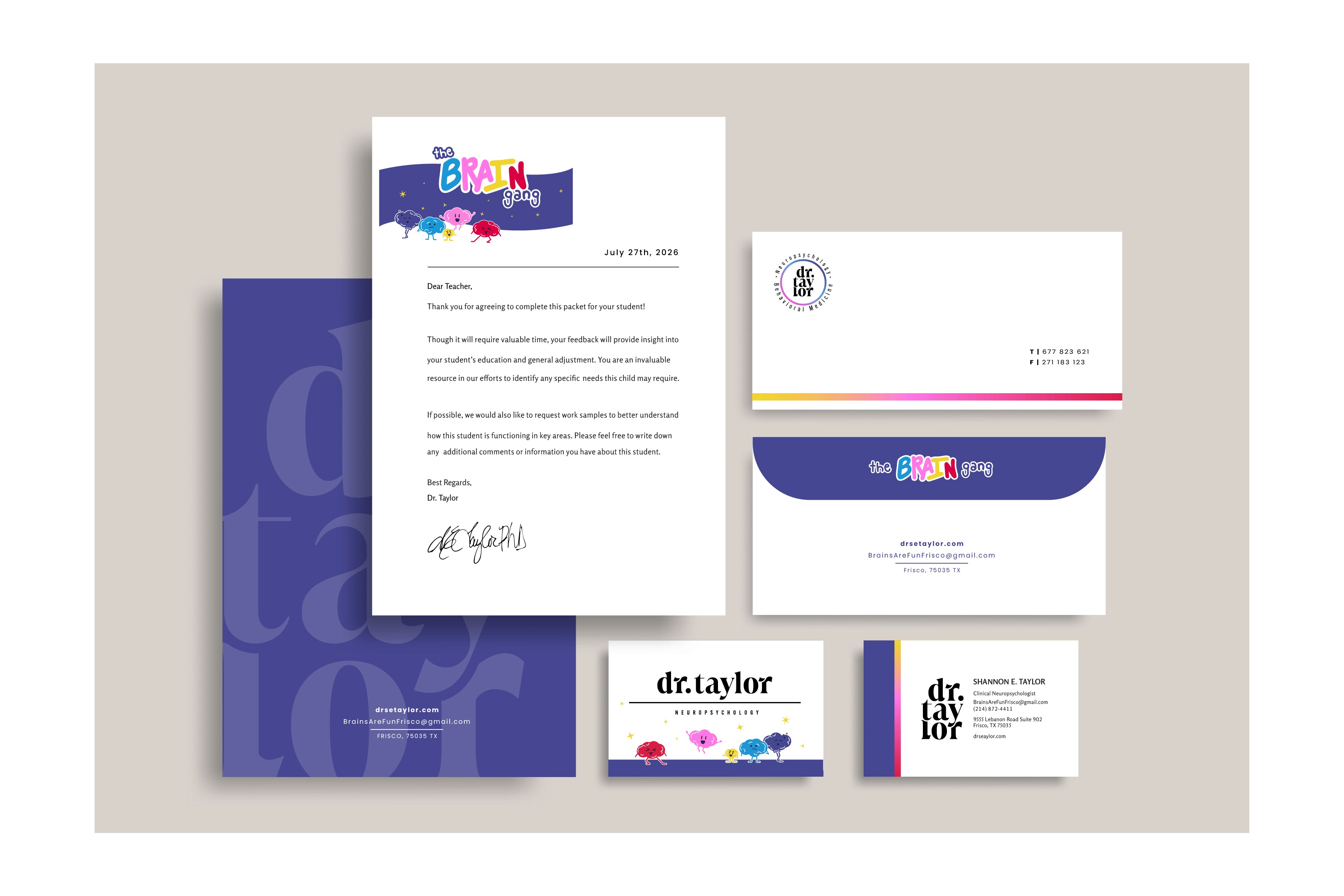
Stationery
Stationery
Stationery
Stationery
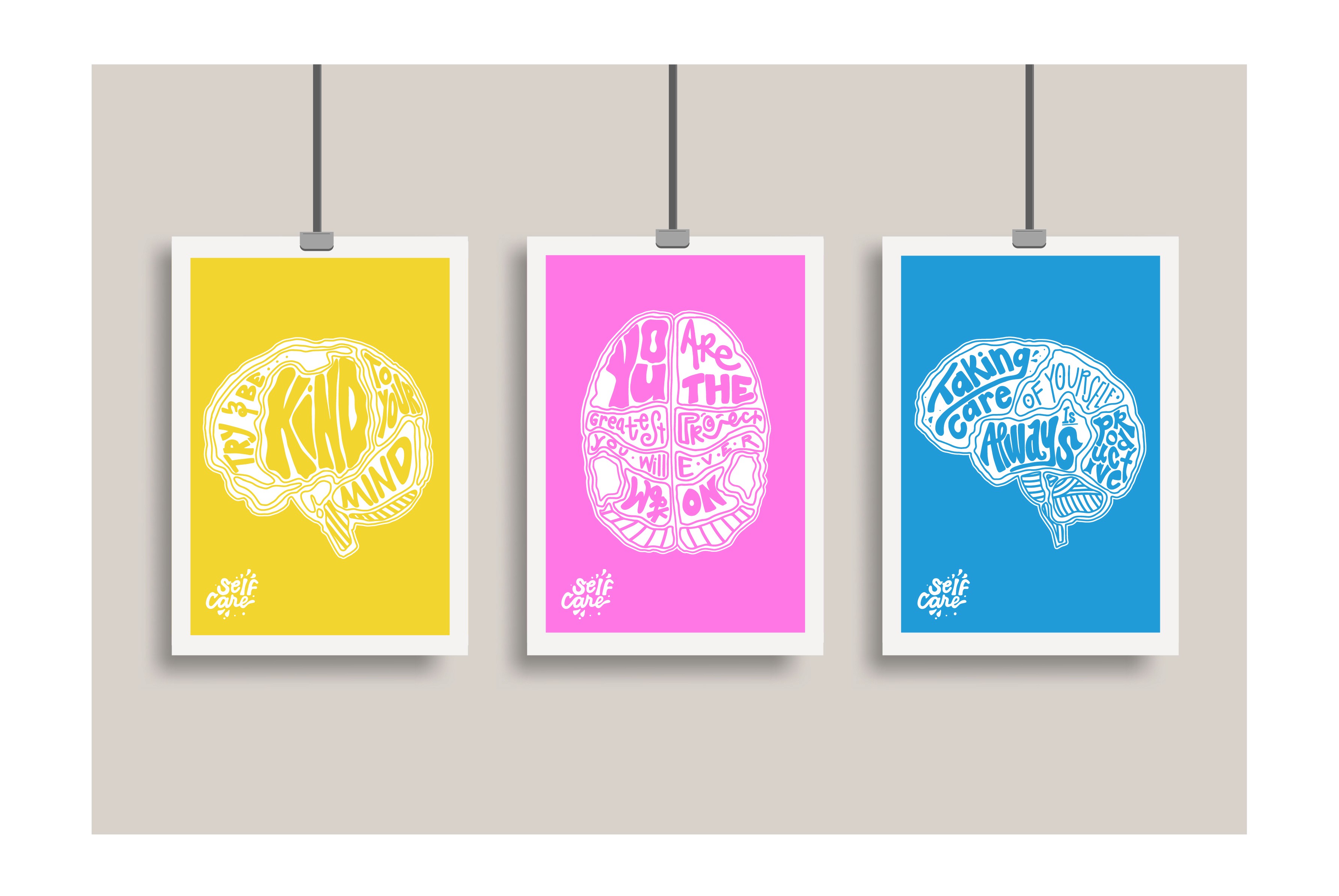
Self Care Poster Series
Self Care Poster Series
Self Care Poster Series
Self Care Poster Series
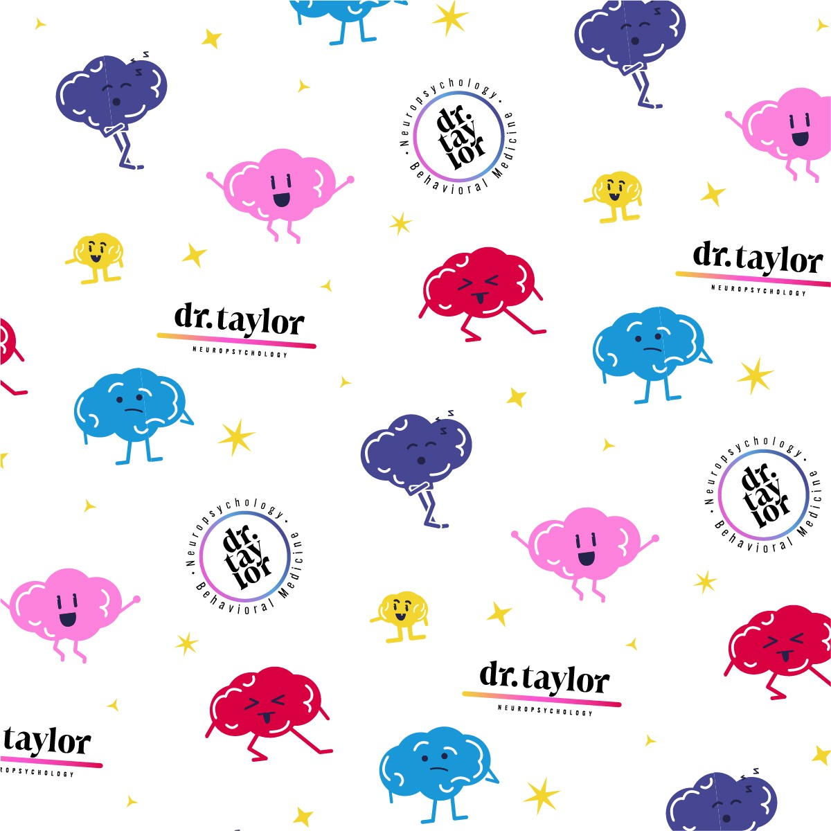
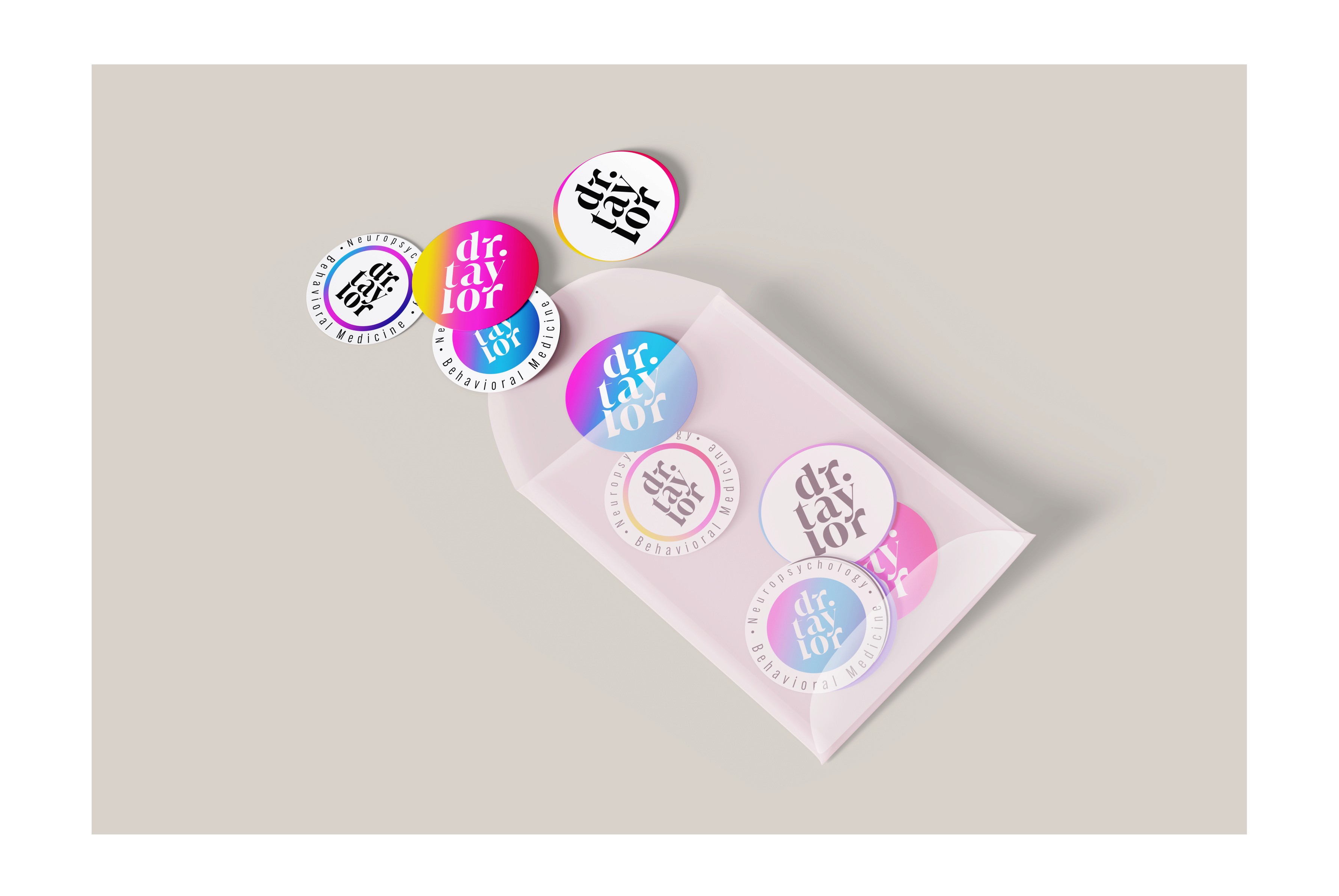
Sticker Pack
Sticker Pack
Sticker Pack
Sticker Pack
Tote Bag
Tote Bag
Tote Bag
Tote Bag

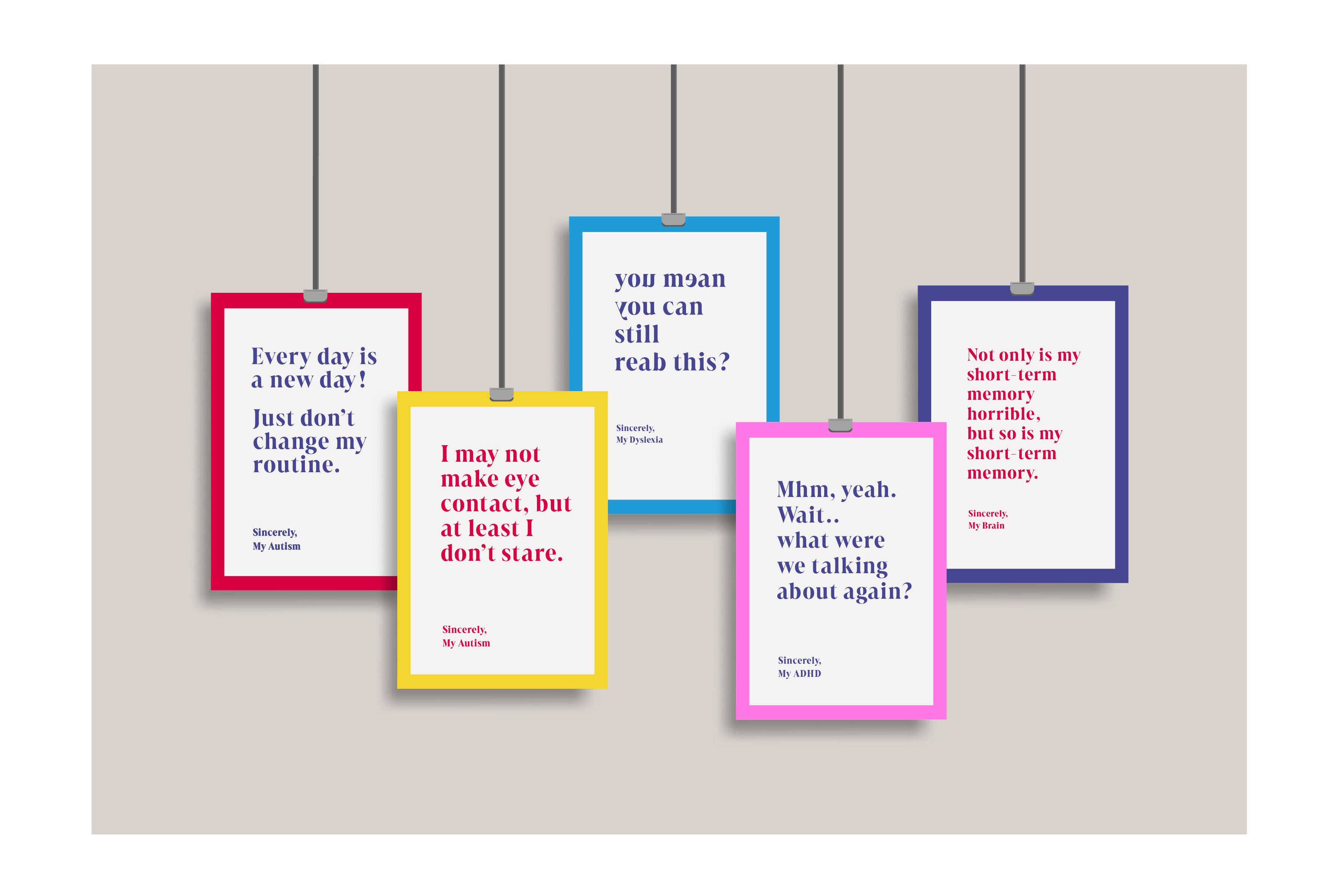
Sincerely, Poster Series
Sincerely, Poster Series
Sincerely, Poster Series
Sincerely, Poster Series
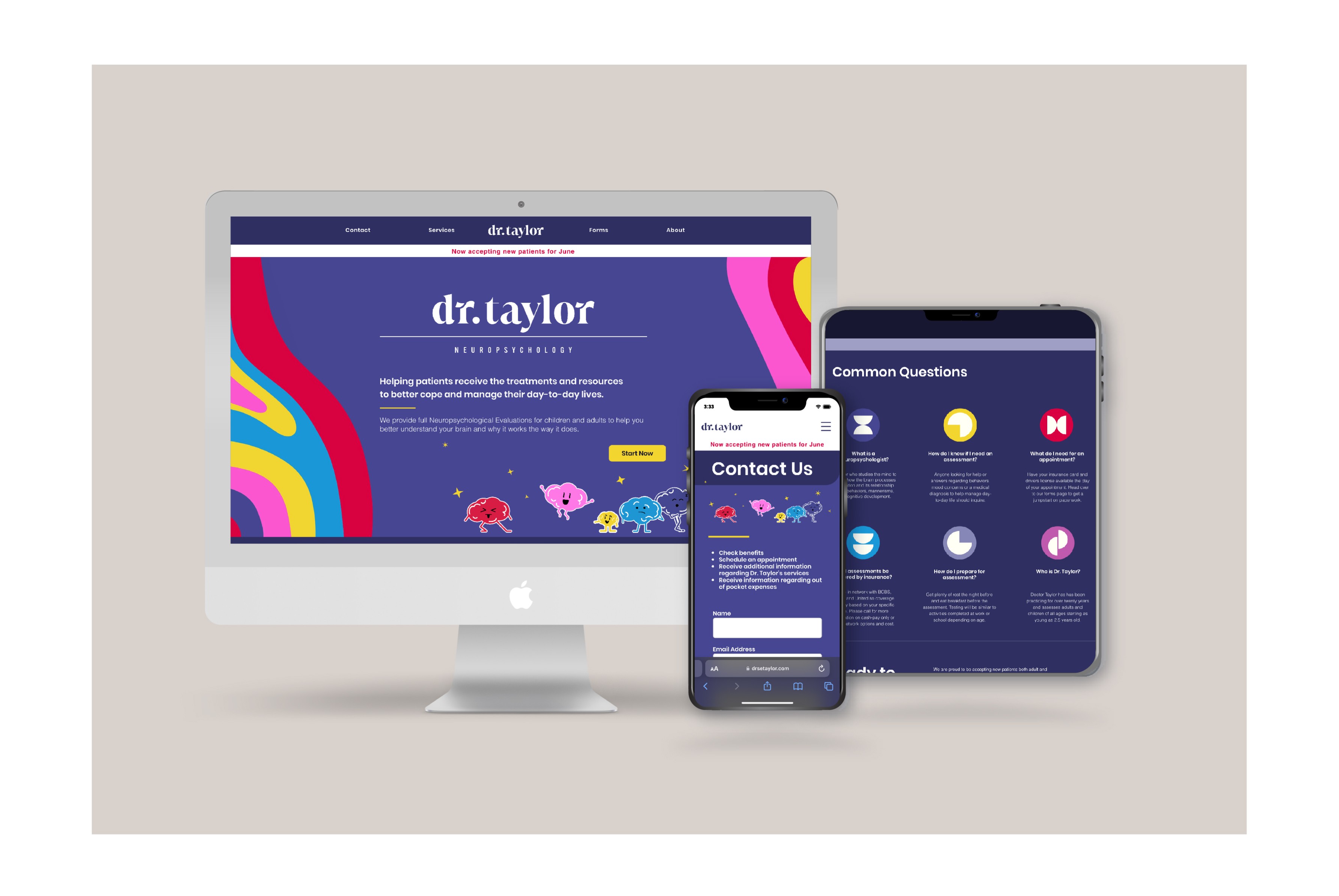
Website Design- to view the live site click here
Website Design
To view the live site click here
Website Design- to view the live site click here
Website Design- to view the live site click here
